반응형
<!DOCTYPE html>
<html lang="kr">
<head>
<title>The Nick Times</title>
<style>
div {
height: 150px;
width: 150px;
background-color: tomato;
}
span {
background-color: turquoise;
}
</style>
</head>
<body>
<div></div>
<div></div>
<div></div>
<span>hello</span>
<span>hello</span>
<span>hello</span>
</body>
</html>
결과
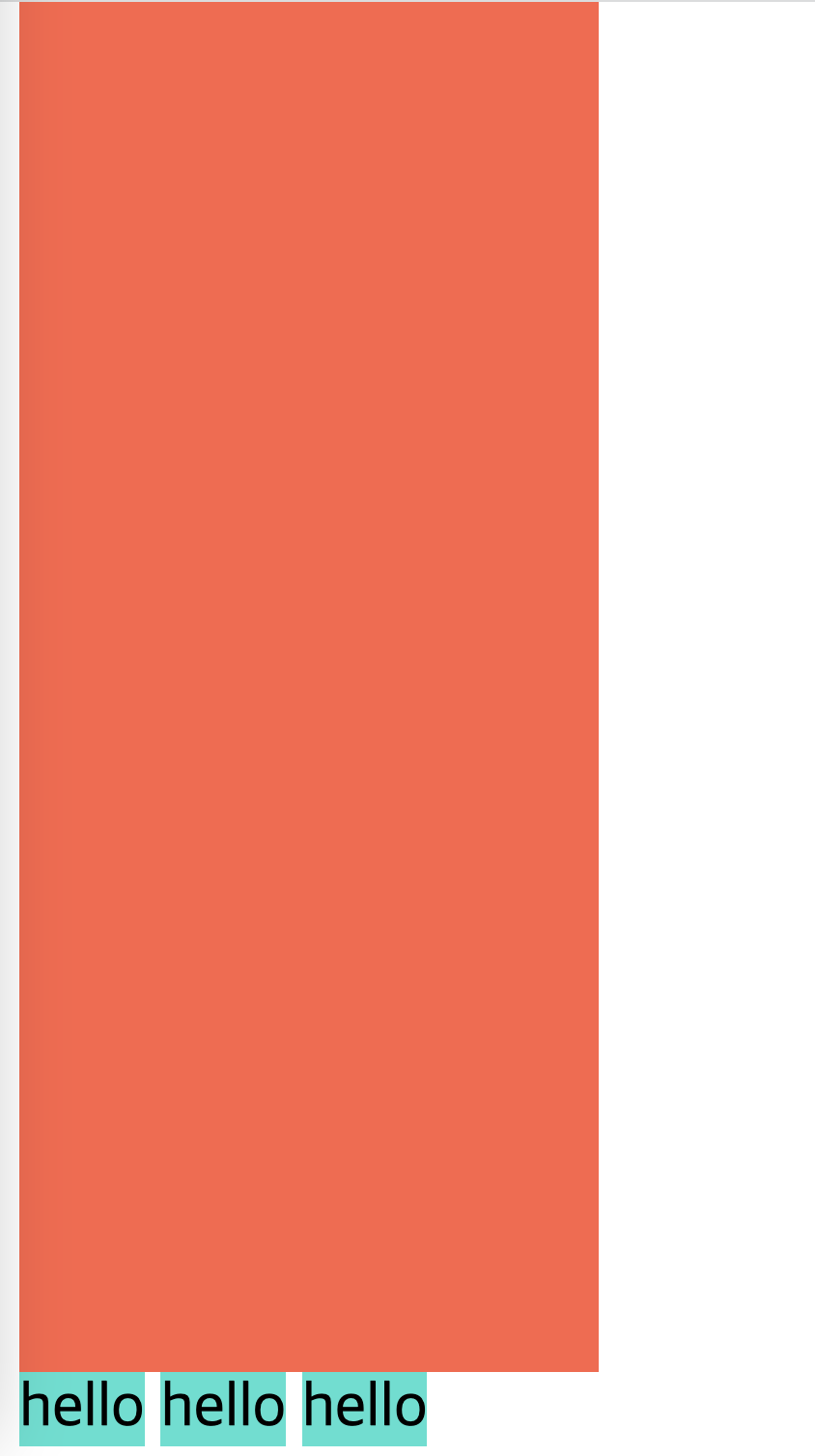
span 은 박스와 다르게 span 옆에 바로 다른 span이 올 수 있다.
<!DOCTYPE html>
<html lang="kr">
<head>
<title>The Nick Times</title>
<style>
div {
height: 150px;
width: 150px;
background-color: tomato;
}
span {
background-color: turquoise;
}
</style>
</head>
<body>
<div></div>
<div></div>
<div></div>
<span>hello</span>
<span>hello</span>
<span>hello</span>
<a href="#">link</a>
</body>
</html>
결과
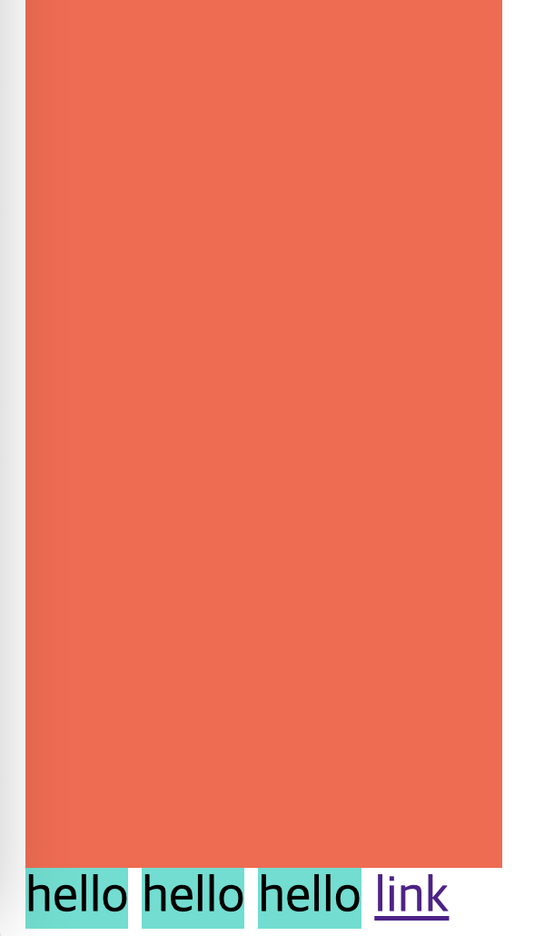
link 도 바로 옆에 위치할 수 있다.
(box가 아닌) span, link, image 등의 특징을
inline 이라고 명칭한다.
* inline: in the same line (같은 줄에 위치할 수 있다)
그리고 inline은 높이와 너비를 가질 수 없다.
반응형
'2. CSS' 카테고리의 다른 글
| CSS 박스의 특징 1. margin (마진) (0) | 2024.11.17 |
|---|---|
| CSS Inline 형태를 block 형태로 바꾸기 (0) | 2024.11.17 |
| CSS 박스(Box)의 개념을 알아보자 (0) | 2024.11.13 |
| CSS의 특징 - Cascading (0) | 2024.11.11 |
| CSS 로 텍스트 가운데 정렬 만들기 (text-align) (0) | 2024.11.11 |