반응형
position: fixed
--> 그 자리에 계속 위치해 있게 하는 것
1.
<!DOCTYPE html>
<html lang="kr">
<head>
<title>The Nick Times</title>
<style>
body {
height: 1000vh;
margin: 20px;
}
div {
position: fixed;
width: 300px;
height: 300px;
background-color: teal;
}
</style>
</head>
<body>
<div></div>
</body>
</html>
결과

스크롤을 계속 내려도 div 박스가 계속 그 자이레 위치해 있다.
postion: fixed; 를 적용하면 가장 위에 있는 레이어가 된다
2.
<!DOCTYPE html>
<html lang="kr">
<head>
<title>The Nick Times</title>
<style>
body {
height: 1000vh;
margin: 20px;
}
div {
width: 300px;
height: 300px;
background-color: teal;
}
#different {
position: fixed;
background-color: wheat;
width: 350px;
}
</style>
</head>
<body>
<div></div>
<div id="different"></div>
</body>
</html>
결과
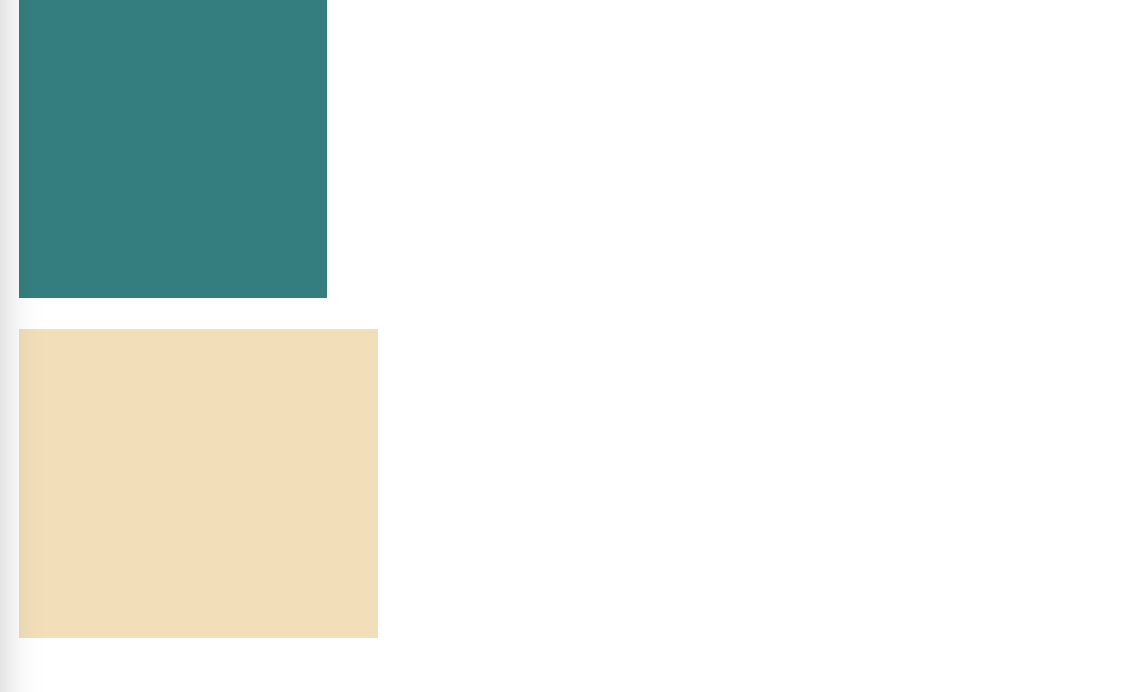
화면 스크롤을 위/아래로 움직였을 때 아래 wheat 색 박스는 고정된다.
반응형
'2. CSS' 카테고리의 다른 글
| CSS position relative 사용해서 div 박스 옮기기 (0) | 2024.11.26 |
|---|---|
| CSS position fixed 사용하기 2 (0) | 2024.11.24 |
| CSS flex-wrap 사용하기 (0) | 2024.11.19 |
| CSS flex 태그: 자식 엘리먼트를 flex 컨테이너로 만들기 (0) | 2024.11.19 |
| CSS flex-direction 사용하기 (0) | 2024.11.19 |